Client and Team
I worked on a team with two other designers for the redesign. The goal of our two-week sprint was to identify possible pain points in the app, and create a design that would re-imagine how users consume content on a daily basis. I was the Information Architect and Visual Designer, and as a part of my role I would be responsible for the site map and navigation schema, high fidelity mockups, style guide, and comparative analysis.
Business Analysis
To learn more about Find It, Fix It and possible pain points, we reached out to the City of Seattle’s Customer Service Bureau. We learned that when users made reports the app routed the complaints to the relevant city department who generated a ticket.
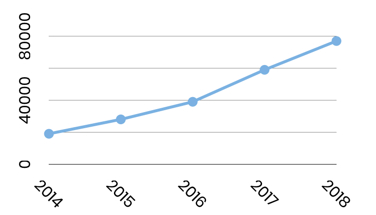
Through reviewing city data we found that a small percentage of Seattleites were using the app. Out of 800,000 residents there are only 37,000 downloads, but the number of reports made have been steadily increasing since the app was released.
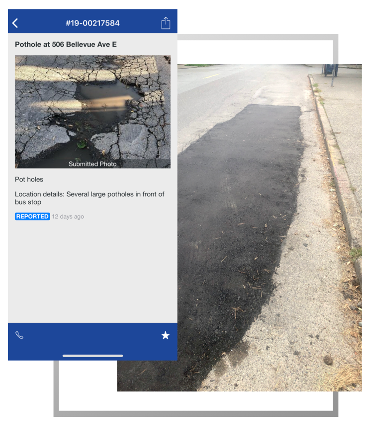
I also learned that the app works. One of the first things I did was to download the app and report a pothole outside of my apartment, and within two weeks it had been fixed.
User Research and Persona
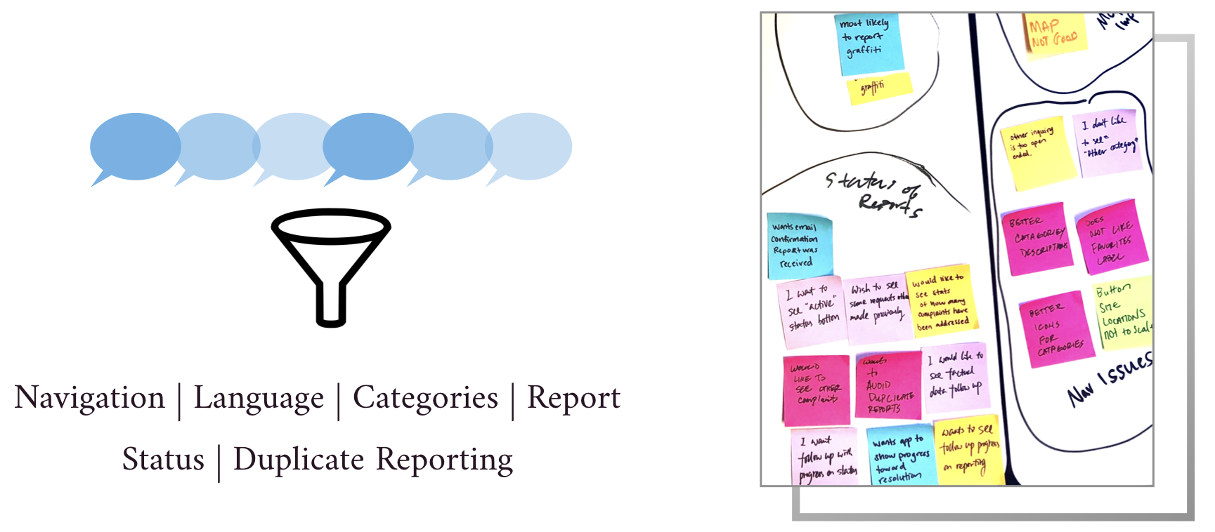
To continue our research we utilized our network to find people that had used the app, and our researcher, Owen Umeda, interviewed 10 participants. The questions covered how easy it was to use the app, what sort of follow up people received on submitted reports, and what categories they were most likely to report. As a team we created an affinity map to synthesize the data.
Key takeaways were that users generally liked the app, but it was hard to navigate. The category descriptions were not clear, some of the verbiage on the home screen was confusing, and the report map was not functional. There was also inconsistency in follow up after the report was made. Users expressed that they wanted to see more information on the status of their report, and were also interested in seeing other reports made in their area to avoid duplicate reporting.
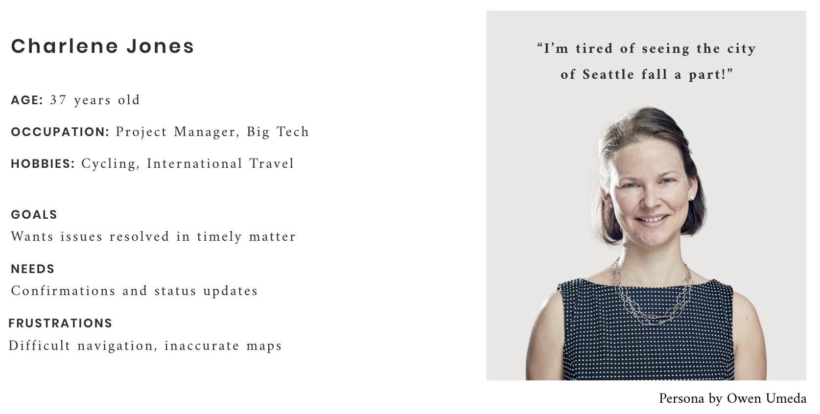
From this data our researcher, Owen, created the following user persona to guide us through the redesign. We could serve Charlene’s needs by improving the navigation, creating a more intuitive request process with streamlined data entry, and providing status updates so she would know where she was in the report process.
Comparative Analysis
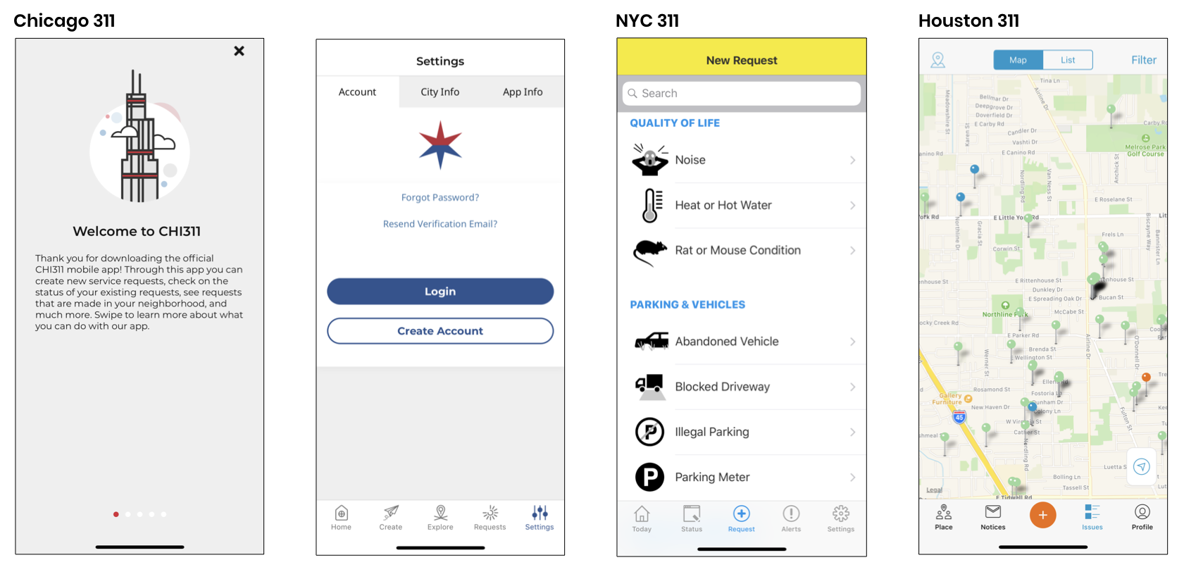
While Owen was conducting the user interviews, I performed a comparative analysis of other city apps to see how they designed their navigation and compare services offered. Key takeaways showed that a number of the apps had intro pages guiding users through main features, and most of them used a bottom navigation throughout so users could easily see where they were.
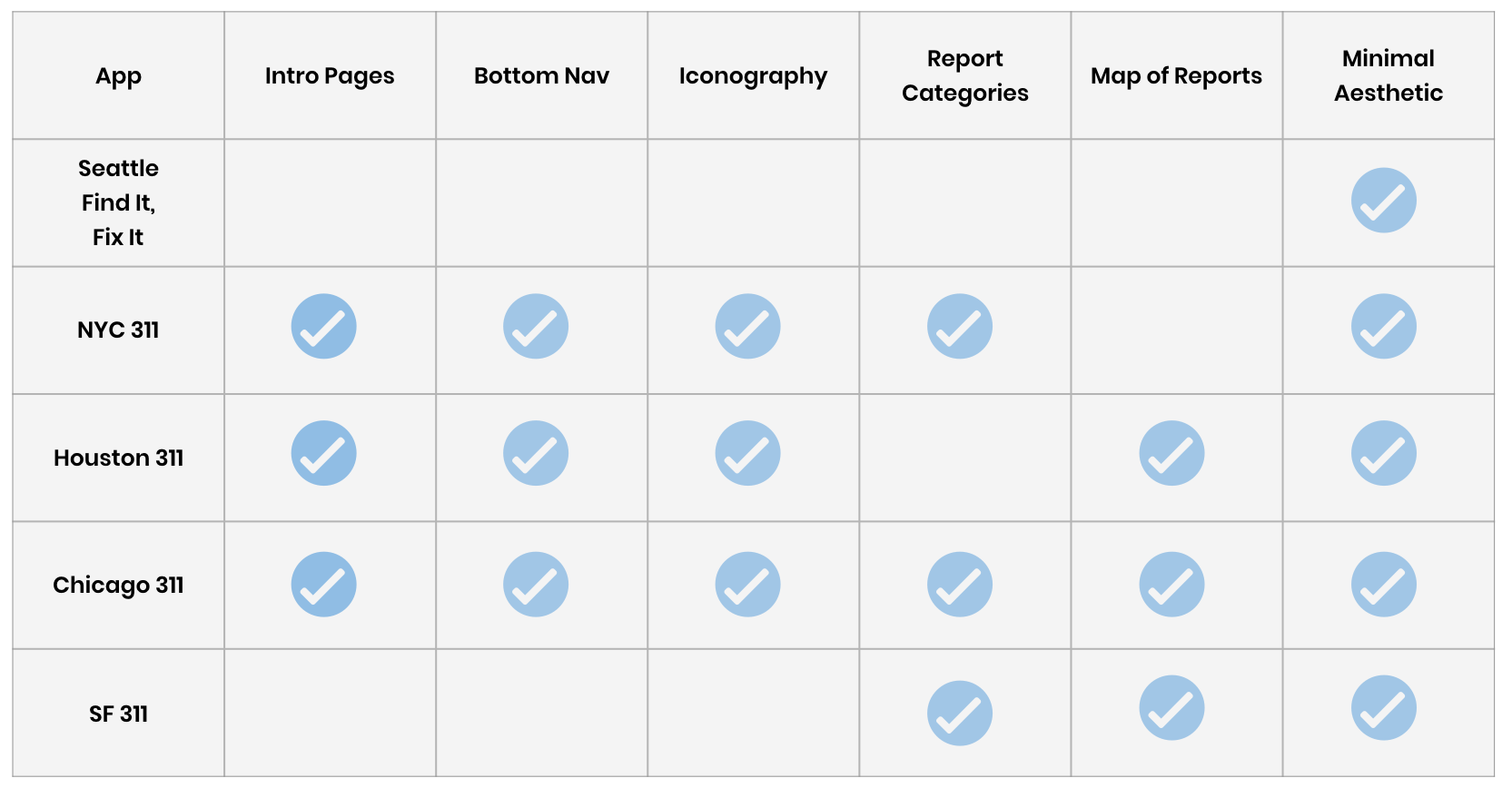
Iconography was used to help identify categories and also made the app feel friendly. Categories were also broken up into smaller groups with headers so users could easily identify the right issue. A number of the apps had a map showing reports made in the city so users could see what was being reported in their area and avoid duplicate reports.
Navigation
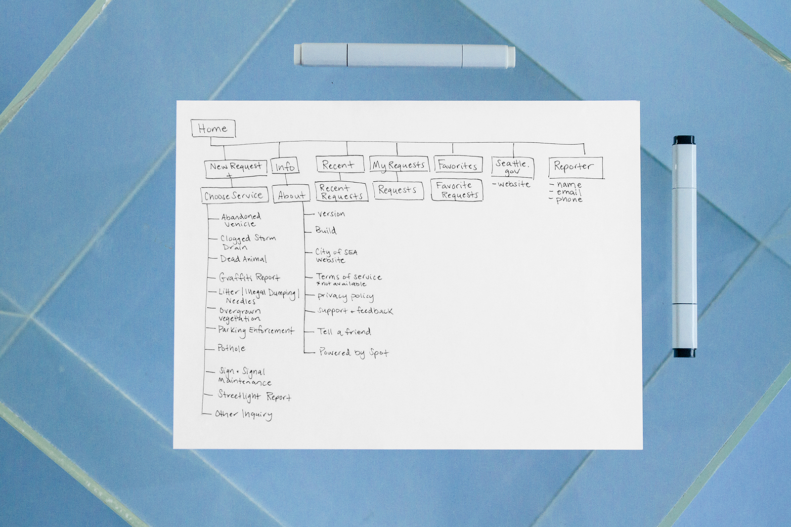
After learning about the user pain points and researching other city apps, I spent some time going through the Find It, Fix it app to see how it compared. In the current app the navigation was between the home screen and a top navigation bar. Several of the buttons took you to the same place, and the Recent Button which is supposed to function as a report map did not work.
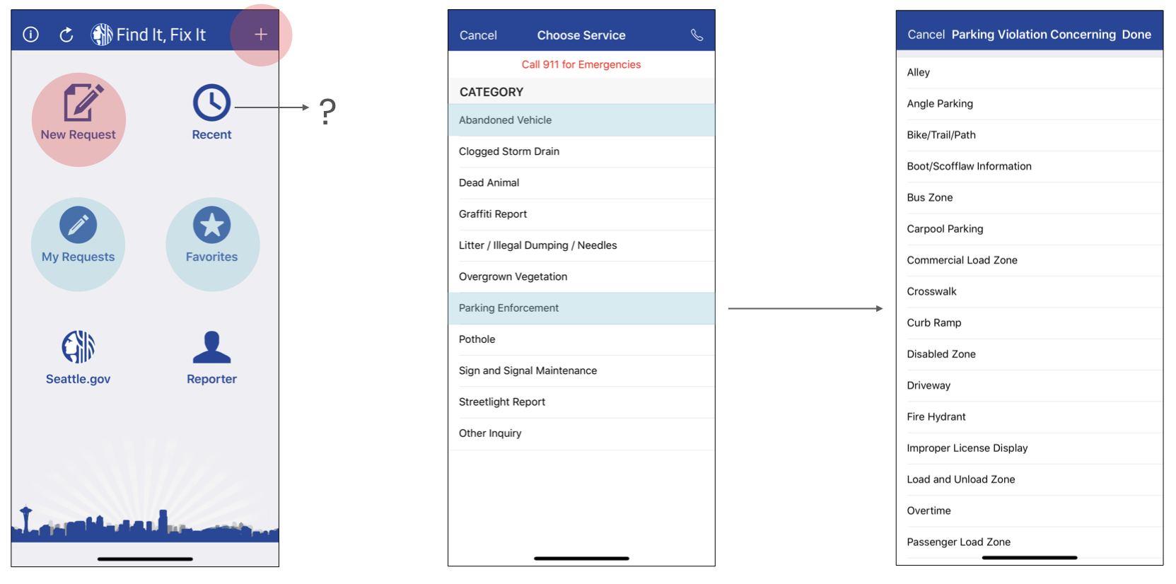
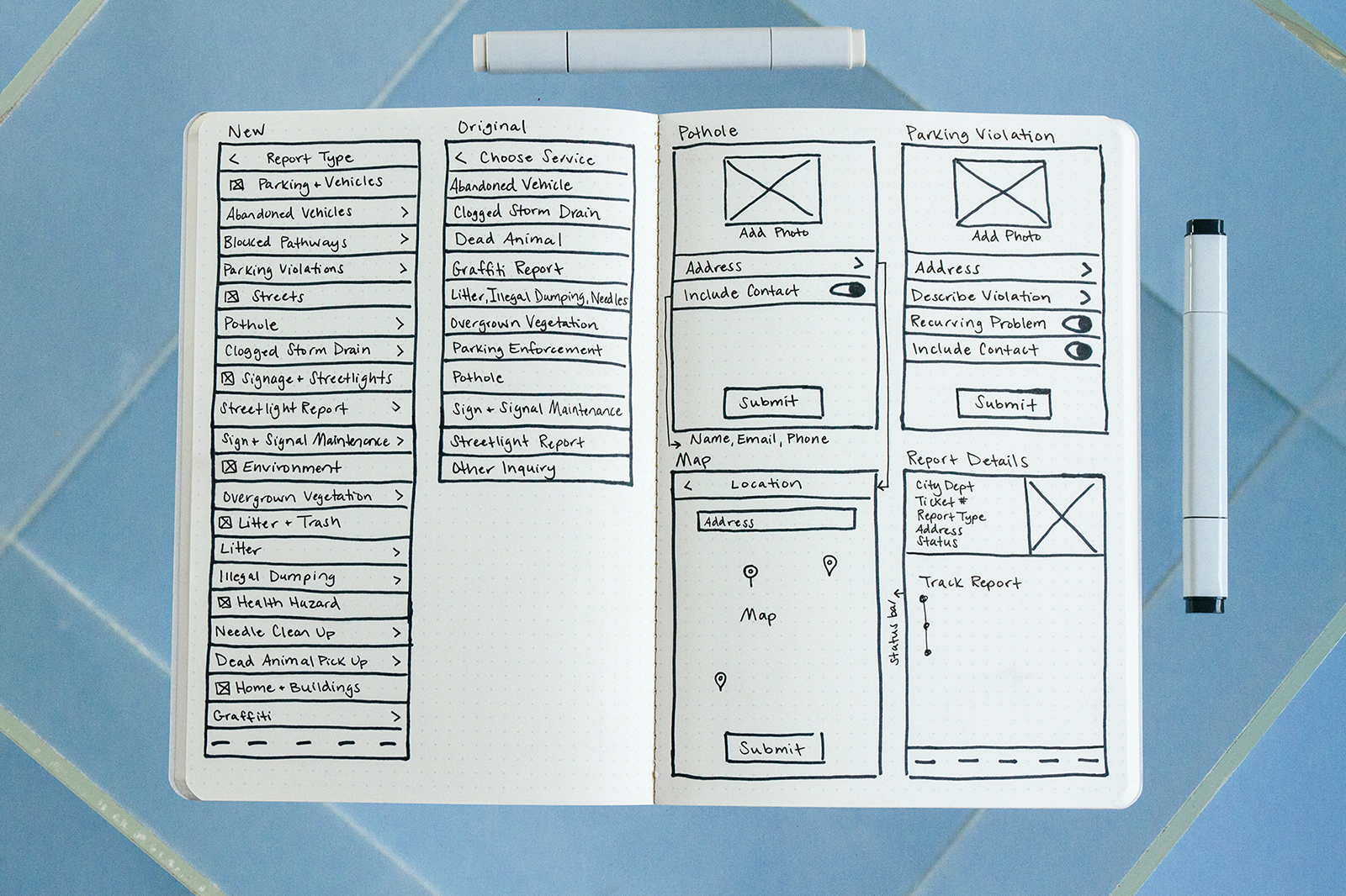
After you selected New Request, you were taken to a service page to select an issue. Like items were not grouped together, and there were no headings which made it more time consuming to find the issue you wanted to report. Once you selected your service, some of the items like parking enforcement had long lists you had to choose from to identify the type of violation.
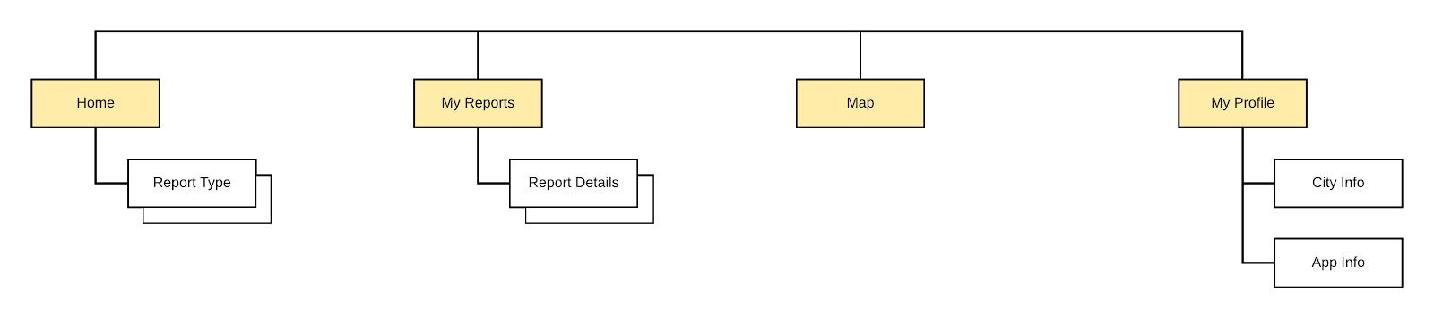
Site Map
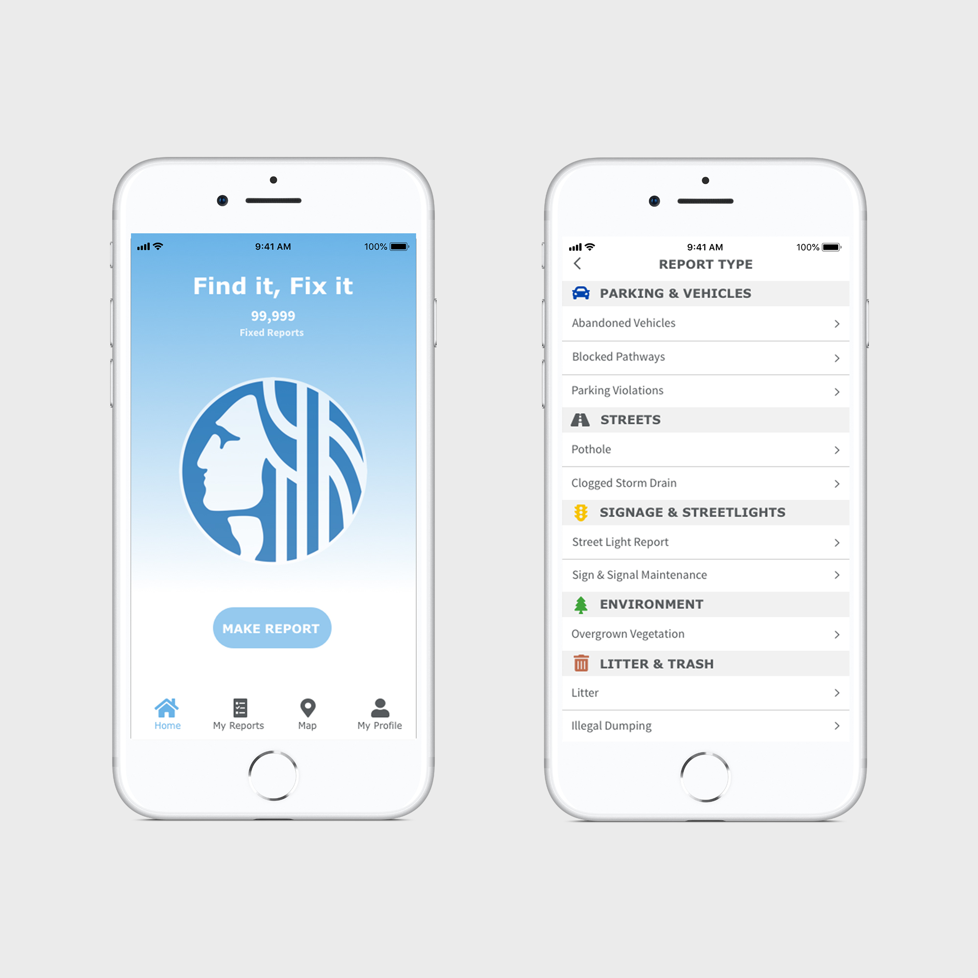
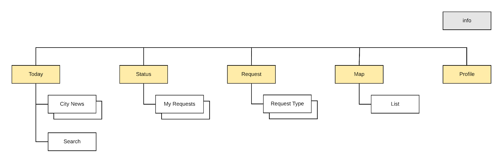
To begin the redesign I sketched out the current site map to get a sense of the content and how it was organized. Our user research showed that some of the navigation elements were not being used. I eliminated duplicate and underutilized items, and changed the primary navigation to a bottom tab bar so users could easily identify where they were.
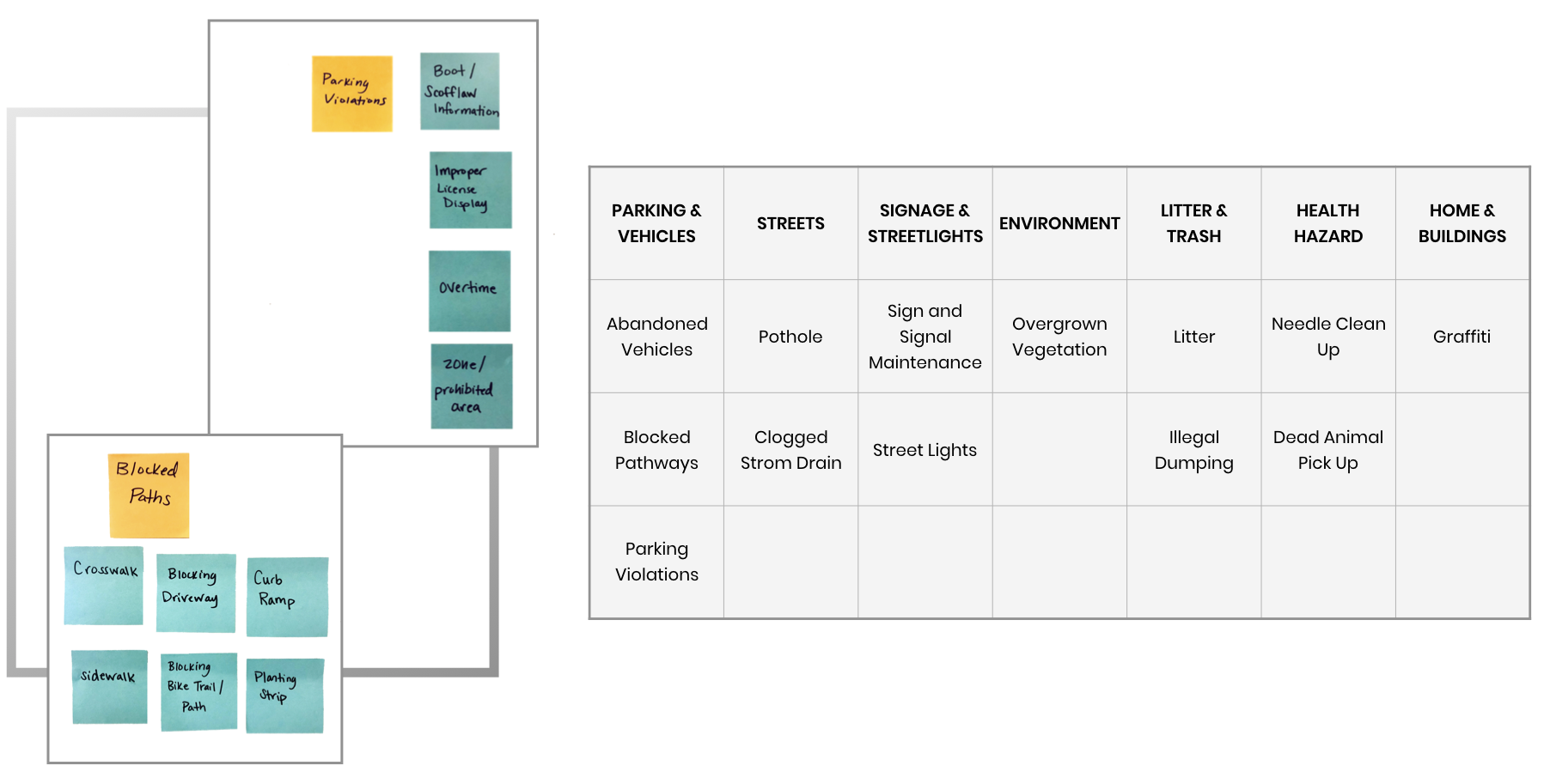
From here I looked at how other city apps organized their service categories and grouped like items together with headings. I performed a card sort to group some of the secondary lists together to reduce the amount of screens and data users would have to sift through. This allowed me to pull some of the larger groupings, liked blocked pathways, into the main category page so users could more easily find the issue they were looking for.
In our research, users also expressed that some of the language used in the navigation was confusing. I looked to the comparative analysis to see what other city apps were calling similar elements to update the content and make the navigation more clear. A number of these apps also incorporated city news or top categories on the home page, so we decided to test this feature with users in Seattle as well.
I developed some wireflows to show visual hierarchy and information that would need to be captured on the report pages. From here I passed the sketches and navigation schema to Shi Chen, our Interaction Designer, to incorporate with the user flow and wireframes.
Style Guide
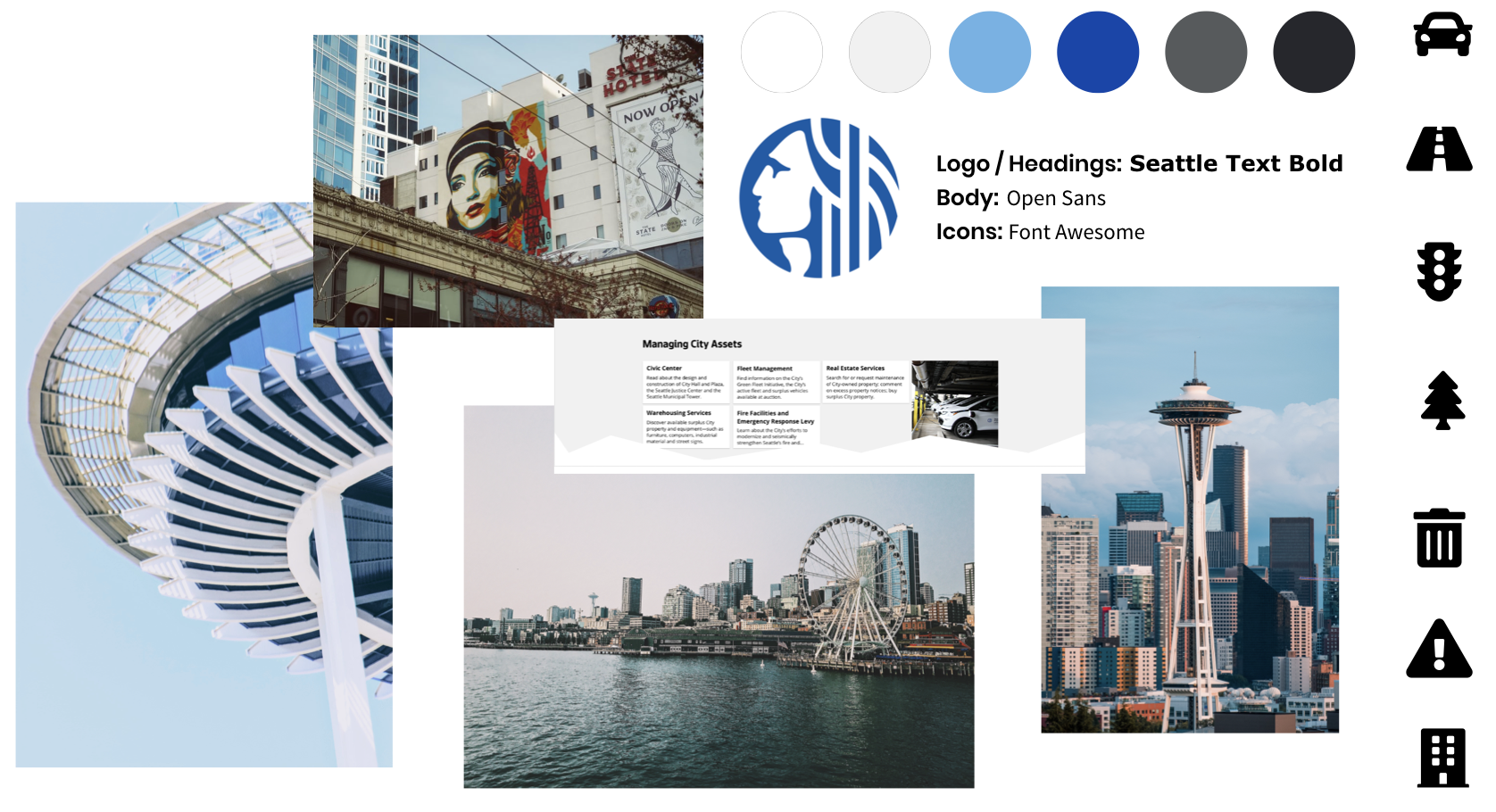
While Shi worked on the wireframes I began developing the visual design. I pulled our typeface, iconography, and color palette from the City of Seattle style guide. For the main pallet I kept the core Seattle blue with grey accents, and brought in a lighter blue to mimic the Seattle skyline. We also implemented the style guidelines for button size and color, line spacing, background, and color blocks of white and light grey to break up categories of content.
Visual Design
The majority of users in our research wanted to use the app to report potholes, so we decided to focus on that user task for our prototype. In the wireframe development we moved through three design iterations and usability tests with 12 participants. We worked as a group to synthesize the results, and Shi made the final wireframe updates and passed the prototype to me to add the visual design.
I began by switching to the correct fonts, using the Seattle Text in bold for the logo and headings, and Open Sans for the body. I used white and dark grey in the text to increase legibility and used light blue in the navigation to show the user where they were in the app.
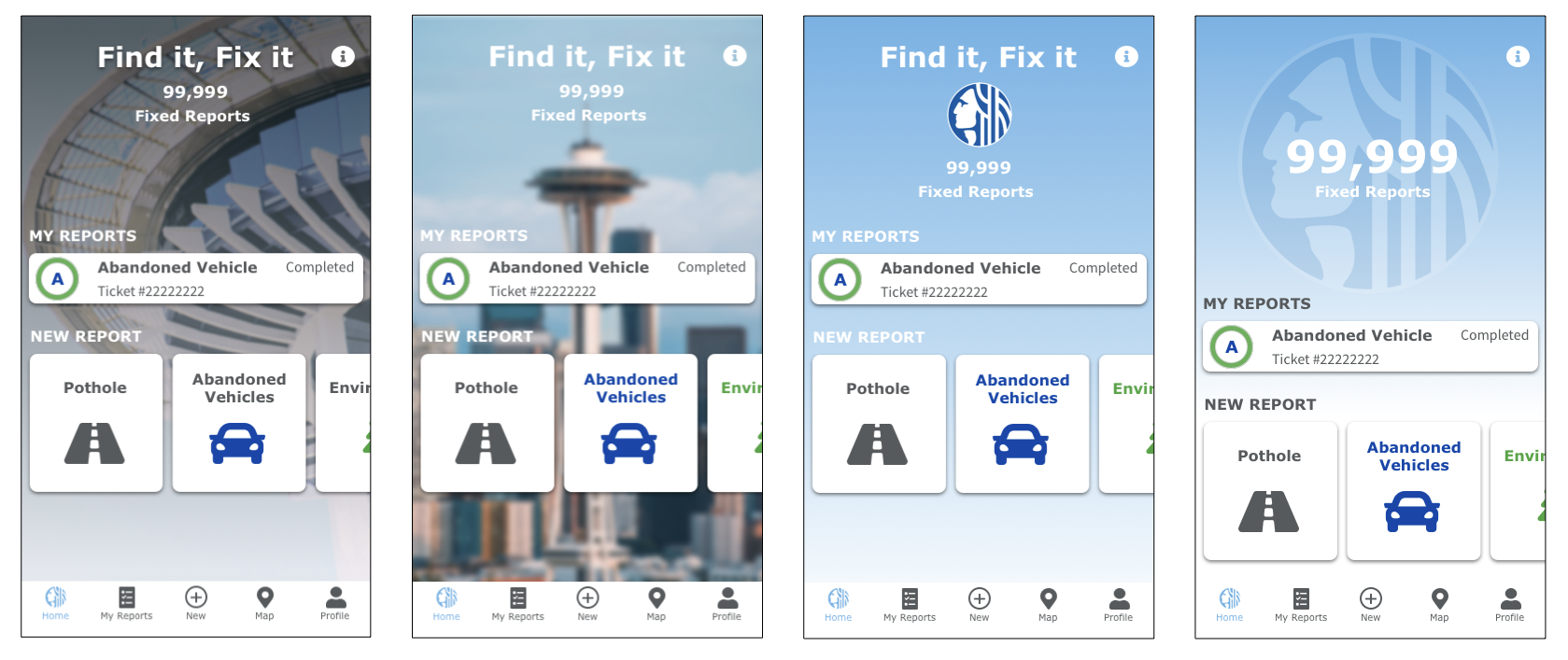
From here I began design explorations of the home page, pulling in iconography for the navigation and playing with images of the Seattle skyline and a blue gradient for the background. In the wireframe iterations we found that users didn’t want to see city news on the homepage, but liked to see the status of their reports or a shortcut to top categories.
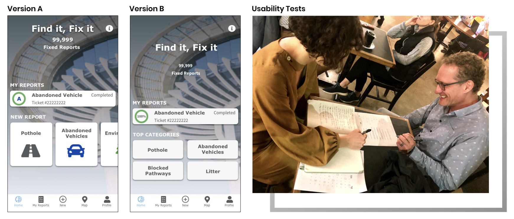
We proceeded with a 4th round of usability testing with the high fidelity prototype. We tested two options of the home screen with four participants and found that users preferred version B. However, we received feedback that the navigation bar felt too small and the home page was cluttered.
Users felt that the background image was distracting, and there were too many elements on the screen. They liked seeing the status of their current report, but if one was shown they wanted all the reports to be listed. They were also not sure why there was a separate tab in the navigation for my reports if it was listed on the home screen. Similarly, users liked the shortcut of the top categories, but were unsure why only four were listed.
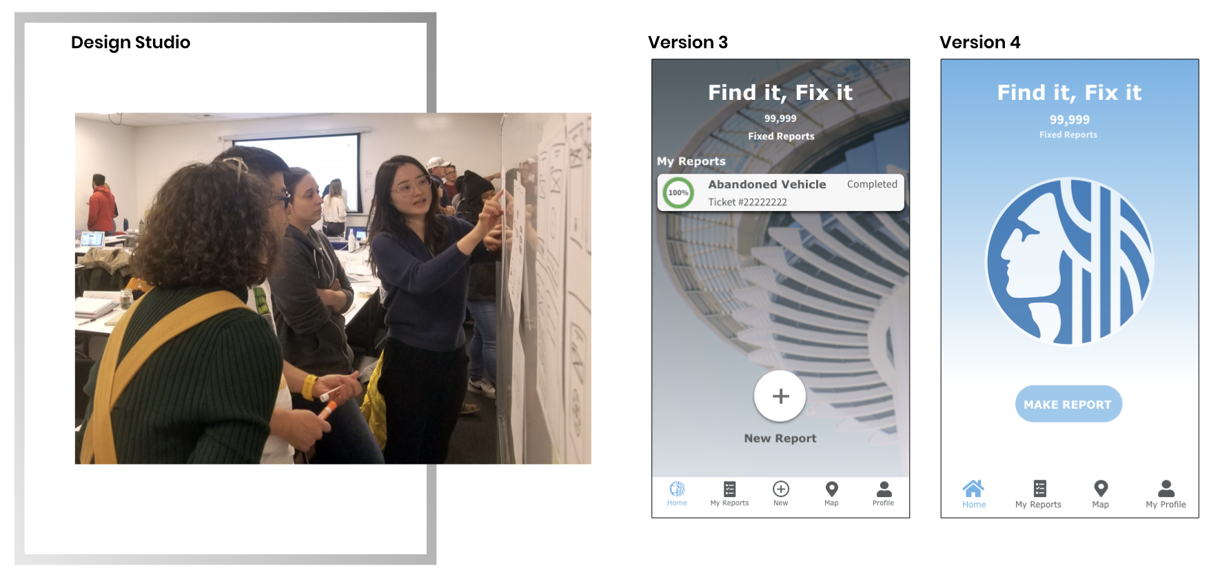
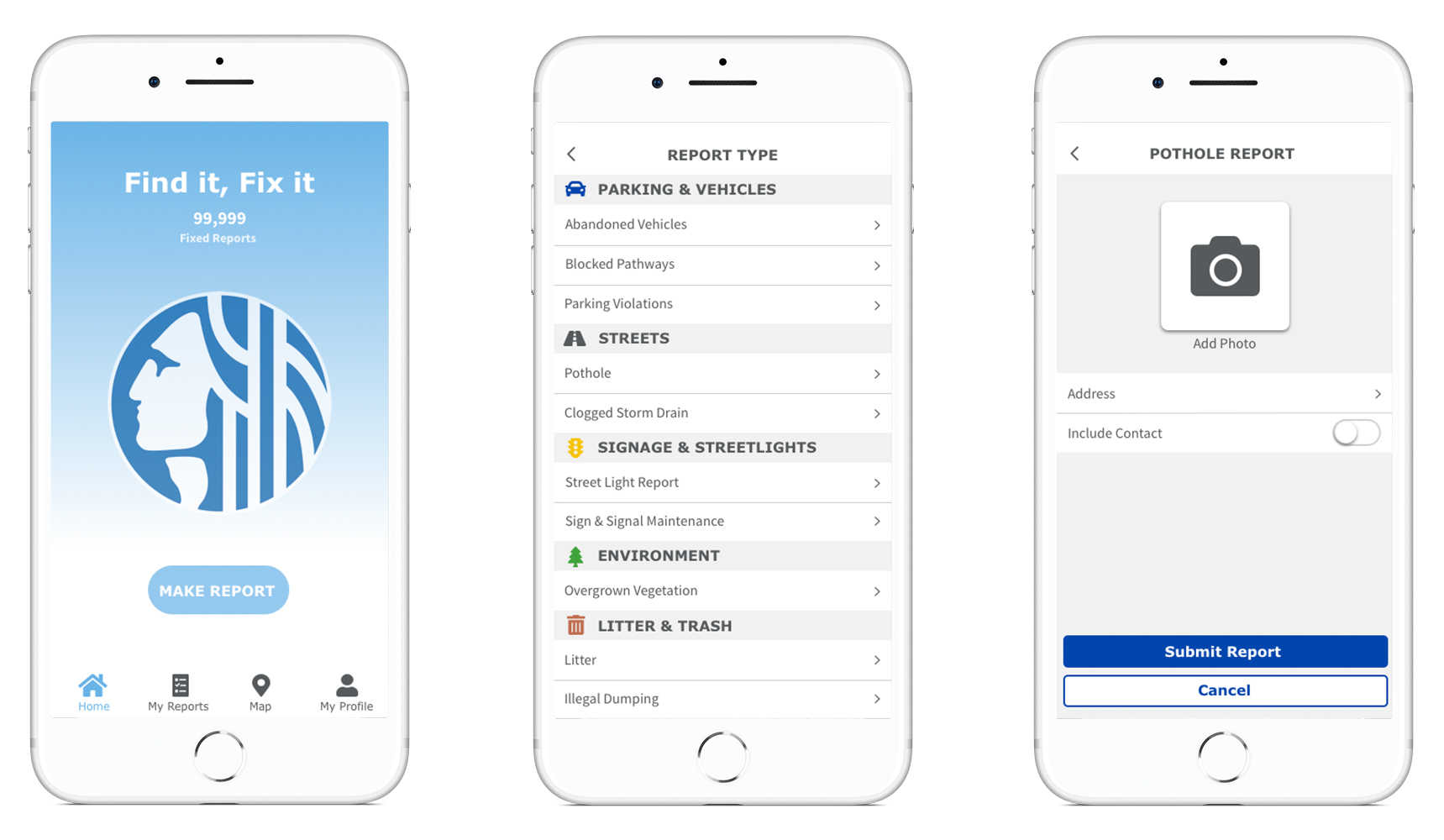
We held a design studio to explore a different layout for the home screen. Reviewing our usability tests, we concluded that ultimately users wanted a quick and easy way to make a report. We found that the best solution was to strip away the extra elements and make the report function the focal point of the opening screen.
I developed several iterations which led to our final design that moved the Report Button front and center on the opening screen, and reduced the number of items in the bottom navigation so they could be scaled larger for accessibility. I replaced the background image with the light blue gradient, and brought in the City of Seattle logo so users could easily recognize it as the City app. I updated our changes to the site map and moved on to the final prototype.
Final Prototype
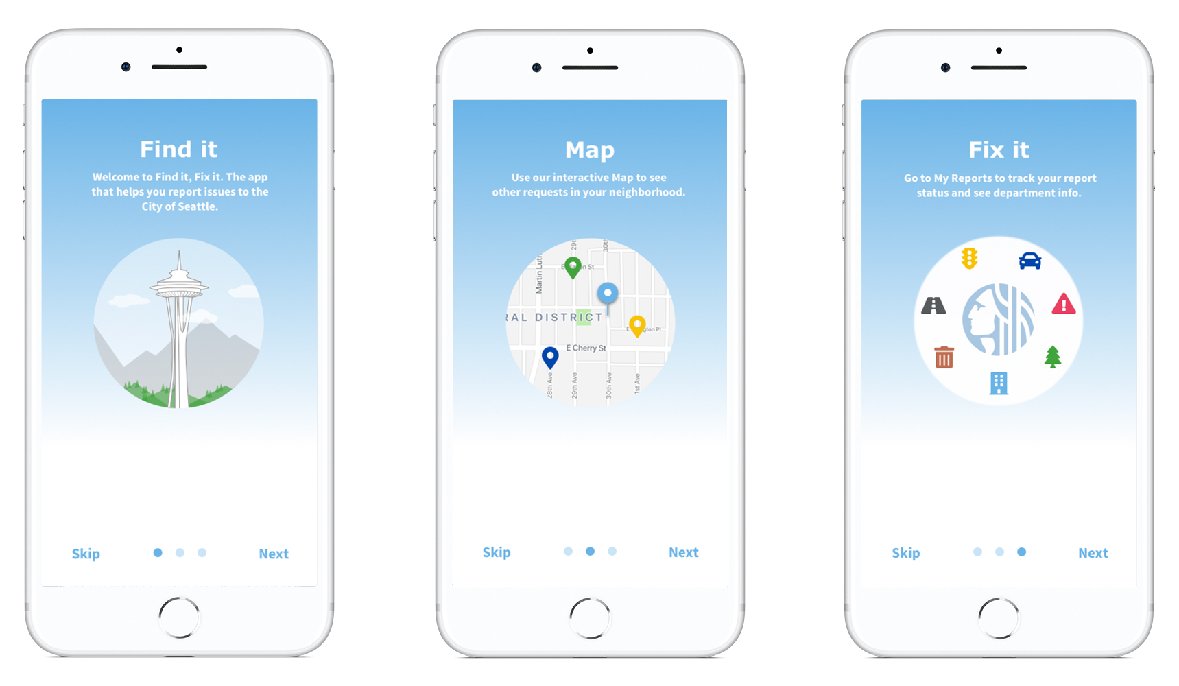
In the final iteration we added a quick introduction to the app. I brought in the light blue gradient to coordinate with the Home page, and added indicators to the bottom of the screen so users would know where they were or skip ahead if desired.
On the Report Type page, I used zebra striping so the categories would be easy to distinguish and added iconography next to the headings. I pulled the iconography and navigational elements from the Font Awesome library in the City of Seattle’s style guide, and used colors from their palette to color code the categories. On the Report page I used their recommended blue and white colors for the call to action buttons and added a page to add the incident photo. I also updated the button size and switch style to better adhere to HIG standards.
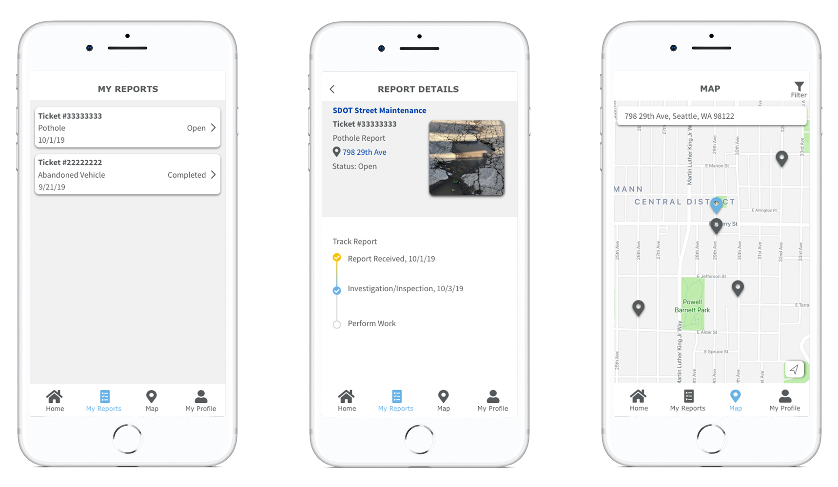
On the Map I added color to the pins to coordinate with their report type, as well as a filter function so users could filter by their relevant category. In our story Charlene wants to report a pothole. On the Map we filtered to show other street reports so she could quickly glance to see if a similar report had been filed in her neighborhood.
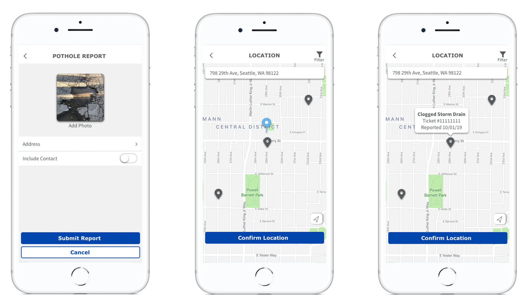
Tapping on the nearby report shows that it's for a clogged storm drain, so Charlene confirms her location to proceed with the pothole report. Back on the Report page, I added a screen with a keyboard to show how users would enter their information.
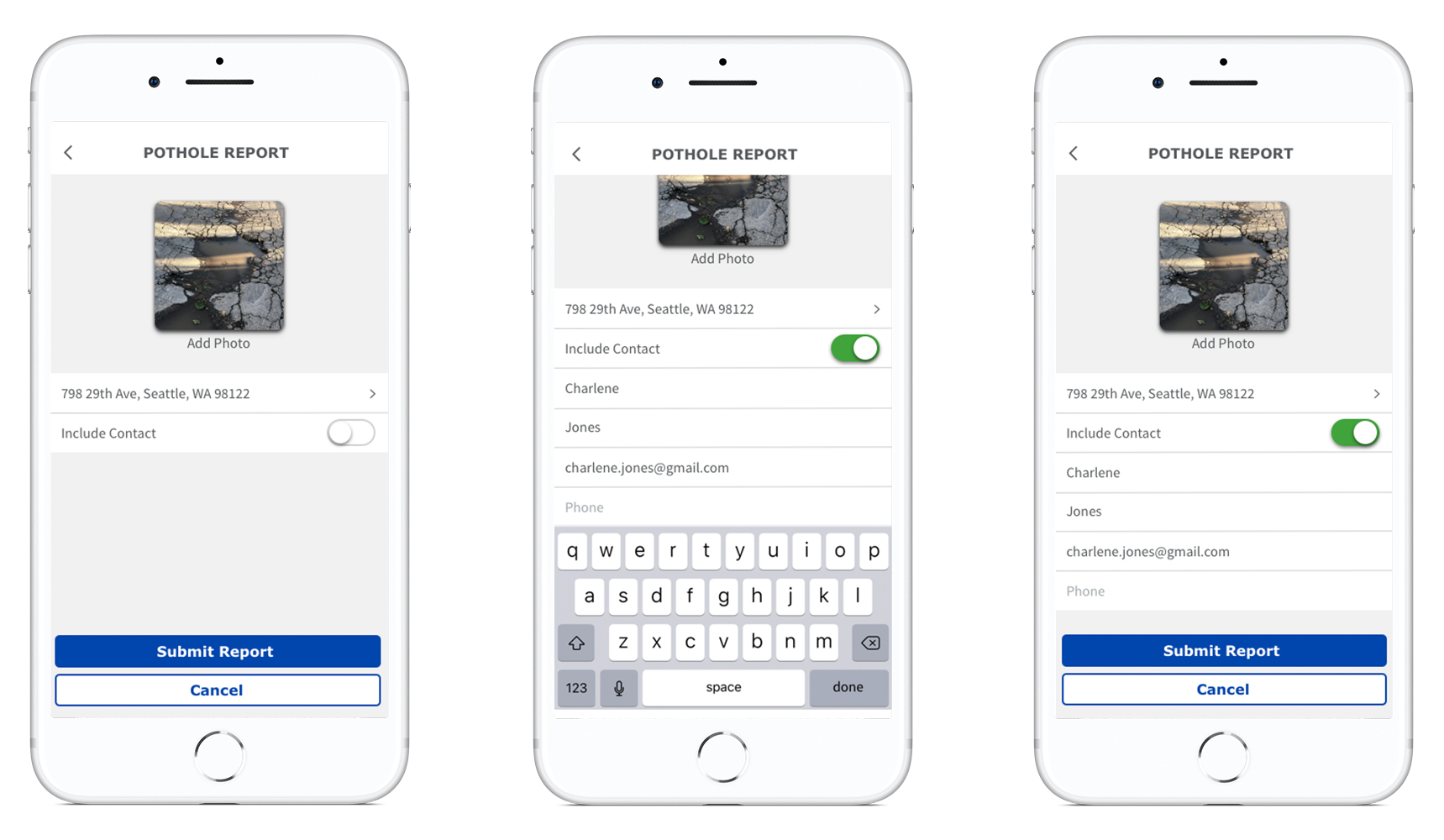
After submitting her report, Charlene is shown a confirmation which I updated to better adhere to HIG standards. The confirmation leads her to the Report Detail page where I used color in the progress bar to highlight how the report was progressing. I also used blue to show that the Street Maintenance Department and map were clickable. This would lead Charlene to the Department's contact information or her report on the map.
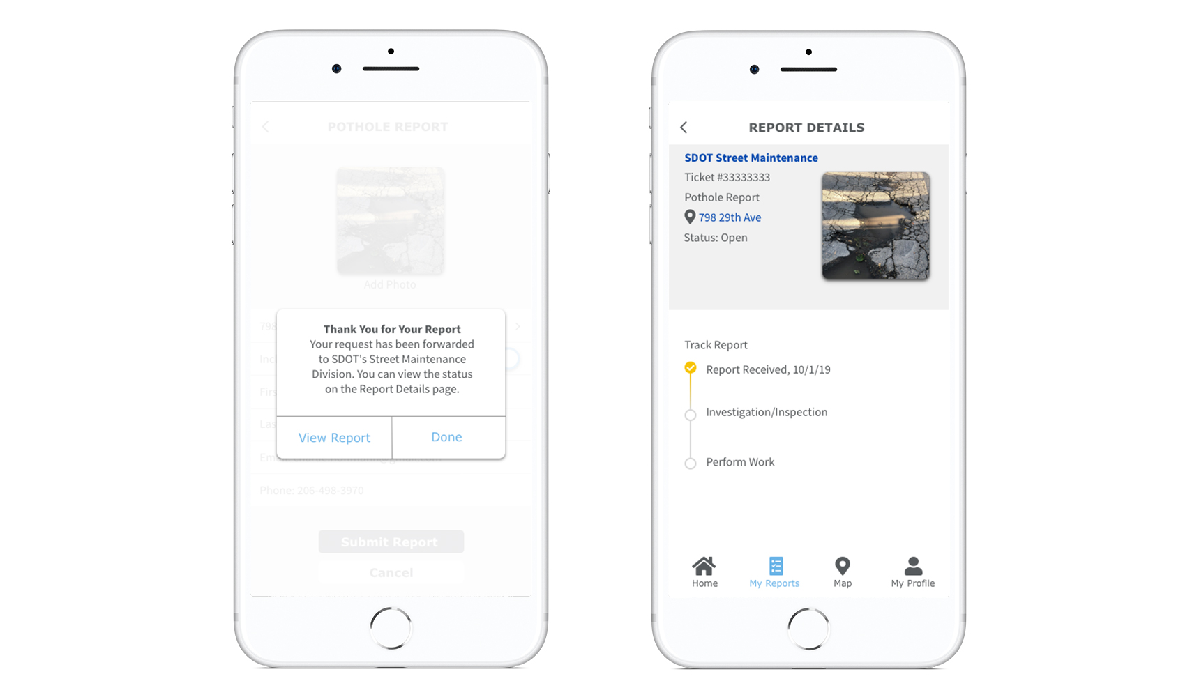
If Charlene wanted to check the status of the report, she could navigate to the My Reports page where all her reports would be listed together. After selecting her report she would be taken back to the Report Detail page, which now shows that her report is being investigated. Navigating to the Map page, Charlene can see her report pin highlighted in blue. This would allow her to easily find her report location if she wanted to see in person how the issue was being resolved.
Learnings
One of the main takeaways from this project was that sometimes the simplest design is best. We had tried offering additional content, like city news or top categories on the home page, but in testing found that this was distracting to users. Find It Fix It isn't an app that people want to spend a lot of time on. Its purpose is to save users time by allowing them to report issues quickly and directly to the City. By streamlining that process and making the report function the only element on the home screen, users were able to quickly get into the app and find the issue they wanted to report.
After the final updates, we tested with five users and were able to improve the system usability scale from a 75 to 83. Users were able to complete the task of reporting a pothole quickly and easily, and expressed that they liked the redesign better than the existing app.
In our next steps we would like to apply the same fixes to the other report categories. We’d like to coordinate with the developers and city departments to see if the status of the reports could be more up to date. The pothole that I reported was fixed during the scope of the project, but my report status on the app was still showing as reported. If the app could sync with their systems to better reflect how the reports are being addressed, it would help to ease this user pain point as shown in our redesign.
We would also like to continue developing the map feature so it’s easier to filter by report type. In our last round of testing users expressed that they wanted to see the correlation between the pin colors and their categories more clearly. Developing a legend or showing the icons on the map could help to solve this usability issue.