


Project Scope
The goal of the project was to improve the shopping and checkout experience for Ada's online bookstore. Ada’s had a clear sense of brand, but it was getting lost in their layout and navigation. Over the course of two-weeks, I would develop a redesign that would better reflect their business and meet their users' needs.
Business Analysis
I spent some time navigating through Ada’s website and compiled a list of questions for the business owners. Specifically I wanted to hear about the history of the business, what made them unique, and learn more about their business goals. I was also interested to learn more about their customers and how they currently utilized the website.

I visited Ada’s retail location on Capitol Hill in Seattle to get a better sense of their identity. I was immediately struck by the store's character. It was full of interesting displays and products, and plaques throughout the space told the story of the business and Ada, whom the bookstore was named after. Ada Lovelace, who lived from 1815 - 1852, is considered to be the first computer programmer, but curiously the website didn’t offer any information on the history of the business or share Ada’s story.

It was also interesting to learn more about Ada’s business affiliates: The Lab, The Office Co-working Space, and Discovery Cafe. The Lab is adjacent to Ada’s and houses a number of their events, and the Office is a co-working space that sits above the bookstore. The Discovery Cafe is not the cafe in the bookstore, but a long term pop-up located inside of The Lounge by AT&T down the hill at E. Thomas St.
Links to The Lab, The Office, and The Discovery Cafe were all prominently featured on Ada’s navigation without a solid narrative describing how they all fit together. It was obvious there was a disconnect between the online and retail experience, so I conducted some user interviews to learn more.
User Research
I interviewed five customers, asking questions about their online shopping habits and how they felt about Ada's current design.
Key takeaways were that all participants mentioned search-ability. When shopping online, they often knew what they were looking for so having a clear navigation and search bar was really important.
They were also looking for recommendations in a variety of forms: based on their past purchasing behavior, customer reviews, customers that had bought the same book, staff favorites, and new releases.
Curation was another key element among users, especially when talking about independent bookstores. As quoted from one of the interviews, “It’s so easy to get lost in the internet. I go to smaller bookstores to have something curated...because I'm gonna meet more people like me with similar interests.”
The interviews showed that when all of these elements were present on a site it helped the user to develop a sense of relationship with the business and build trust.

User Persona
For the redesign we were provided with a list of user personas we could use in our development. I focused on the persona John Goodson, a 38 year old art teacher, with a 12 year old daughter. He’s looking for things they can do together on a budget and is interested in quality, exclusivity, and cool factor of his purchases.
-1.png)
John was a good match for Ada’s because his needs and pain points were similar to those found in our user research. He would also appreciate their unique branding, and they offered a lot of products and events that his daughter would enjoy. In order to meet John’s needs we would need to address the below points:
- Establish trust and relationship
- Easy navigation
- New additions to inventory
- Activities he can do with his 12 yr old daughter
- Product reviews / recommendations
- Easy shipping / returns
Competitive Analysis
Next I performed a competitive analysis to see how Ada’s compared to other bookstores in the market. John had been confused by Ada’s navigation so I was curious to see how other bookstores organized their sites.
First I looked at independent bookstores like Powell’s, Elliot Bay, and Open Books, who all had the search bar prominently featured in the global navigation. They also emphasized what made them unique in their navigation and homepage: interesting book collections, events, or staff picks that would lead the user to products they might not discover on their own.

I also looked at some larger chain stores like Barnes and Noble and Amazon. They featured a prominent search bar, and on their navigation and home page you would find best sellers, new releases, discounts, and recommendations. In my research, I found that users were generally going to the larger chains for price, breadth of inventory, and search-ability. They also really liked the recommendations based on past purchases or other customers that had bought the same book.

When compared with Ada’s website, all the other stores had a search bar prominently featured. Ada’s had one, but it was in the middle of the page which was not a common placement.
The other indie bookstores used events, recommendations, and a clear brand identity to help distinguish them from the larger chains.
Ada’s does have staff picks, but they’re hidden under the store link and could be featured more prominently. Similarly, the event calendar was featured in the middle of the home page and could be easily missed.
User Story
To get started with the flow and navigation, I created a storyboard to map out John's journey and pain points with the current design. I chose to focus on signing up for an event because I learned that Ada’s has unique events which set them a part from other businesses. The events also bring more people into the store and help to create a sense of community for their customers.
John has been looking for activities he can do with his 12 yr old daughter on a budget. His daughter’s been reading a lot lately, and he was thinking about signing her up for a book club.
He heard about this cool bookstore, Ada’s Technical Books, on Capitol Hill that has events. He goes to their website to see if they’d have any book clubs that would be appropriate for young teens.
John has a lack of trust with unfamiliar retailers, and when he goes to the current website he’s put off by the navigation and gets frustrated when he has to click through multiple pages to find the event and book he’s interested in. When he does find it, there isn’t a way to sign up online so he gets frustrated and leaves the site.

Problem and Solution
This led me to the following problem and solution statement:
John needs a better way to look for events on Ada’s website because the current design is confusing, and he wasn’t sure how to register for a book club and buy a book for his daughter.
We believe that creating a clear navigation and flow will help build trust and enable John to seamlessly find the event and book he is looking for.
We will know this to be true when John successfully signs up for the bookclub and purchases the book for his daughter.
User Flow
With this story and solution in mind, I drew a user flow to map out John's journey. The first thing John would need was easy access to an event page. From there he would want to quickly scan over the event details so he could determine if it was the right fit for his daughter’s interests, schedule and budget. If the event looked good, John would need a way to sign up and purchase the book.

Site Map
This led to the Site Map. In the top navigation in grey, I included a search function, login, and cart so on any page users could quickly search for what they needed or check their status.
In the global navigation in yellow, I featured two of the store pages, New Releases and Staff Picks, to better align with their users' interests. I also added an Events page so users like John could quickly check what was coming up on the calendar.
I grouped all of the Ada’s branches under Ada’s Family where users could go to learn more about their different locations and offerings. A lot of these links went to their own websites which I highlighted in blue.
Lastly, I put the Contact, Location, and About page in the footer. This was a common placement on other sites, and grouped all of the contact and business information in one place.

Sketching
From here I started sketching. The current layout did not fully utilize a grid system. I wanted to implement that into our designs to streamline the information and make things easier to navigate.
Through the user research and business analysis, I learned that people go to small bookstores like Ada’s for the experience and unique recommendations. The story of Ada is compelling, and their focus on technical books and learning helps to set Ada’s Bookstore a part from their competitors. This gave me the idea to use the outline of Ada from their logo as an element that users could interact with on the page.

Digital Wireframes
After developing the designs I started wire-framing. On the Home page I chose to keep the large hero image at the top. I changed the home navigation to their logo and justified the main navigation next to it. I brought the search bar up to the top right of the page next to the cart and login so users could easily check their status.
As a small bookstore, users were most interested in Ada’s unique point of view, recommendations, and events. With this in mind I decided to feature New Releases, Staff Picks, and Best Sellers on the Home page. Users also expressed being overwhelmed by the amount of text shown on online bookstores. To solve for this, I featured images of the books with a hover feature to show the book summary as you engaged. This kept the layout clean and allowed the user to see if they were interested in learning more before navigating to another page.

On the Event List page users could filter by event type to narrow the results. I included the hover feature here as well so the event information would appear when engaged with. Once they clicked on the event it would take them straight to the event listing.
I went through several iterations of the Event List page before settling on this design. In the original design, I had incorporated the Ada logo as an interactive element on the page. When a user would click an event listing, the left menu bar would change into the event description and Ada would become clickable. The idea was that users could preview the event information while adding an interesting interaction with the brand. Once they found something they liked, they could click on the event description or Ada Button to navigate to the Event page. After testing this design, I found that when users clicked on an event most of them didn’t notice that the page had changed. They expected to be taken to the Event page when they clicked on the event image the first time and were lost when that didn't happen.

In the second iteration I updated the Ada button to change color once the event listing was clicked to see if this would solve the problem. However, users were still having issues with the design, and thought it was just a logo and not a clickable button on the page. This led me to get rid of the Ada button and add the hover features so the event information would appear when engaged with. Once they clicked on the event it would take them straight to the event listing, which performed well in testing.
Once on the event page they could preview the books for the season, sign up for the bookclub, and click to purchase the book. In testing users were a little confused about the verbiage for signing up for the book club. They also wanted to see more information on the books and where / when the book club would meet. I updated the event page to include this information and changed the verbiage so there was a clear call to action. In the third iteration, I added the hover feature over the book schedule so users could quickly glance over the content of the books being featured. This would be especially helpful for parents wanting to make sure the content matter of the books was appropriate for their children.

On the Book page I included the reviews featured on Ada’s original site, but changed the layout so it wouldn’t feel like one long column of text. I also added in recommendations based on the book's category so users could discover more books that would match to their interests. Users could preview their order by viewing the cart, and at checkout they would have the option of signing in as a guest or creating an account.

Based on learnings from research, I broke the checkout into several pages so as not to overwhelm the user with too much information at once. I included links at the top so they could track their progress and navigate back to previous pages if they needed to update their information.
Through the user research I learned that customers were hesitant to give out their email, so I placed that at the end of the checkout process so it wouldn't deter them from making the purchase. I also used the Ada logo as a progress bar to bring a fun element to the checkout experience. With online shopping you often lack the personalization that occurs in the retail store, so this element helped to create more interaction and build a relationship with the brand.

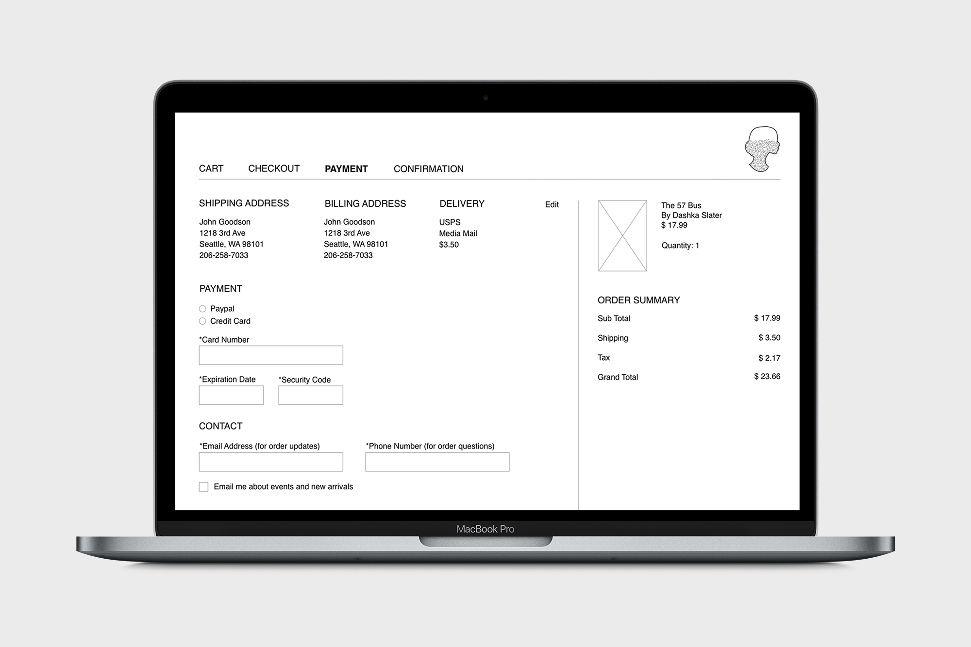
In the first iteration of the payment page, several users mentioned that the billing address input was confusing because they had already entered their address on the previous page. Another user felt that the placement of the credit card field at the bottom of the page caused it to get lost. They also mentioned wanting to see their order summary at the top of the page, and that the size of the Ada progress bar was a little distracting.
I added a checkbox on the Checkout page to use the same address for billing, so that if selected their information would populate on the Payment page. I moved the payment information up to the top of the page and made the Ada progress bar smaller, moving it to the top right corner in line with the navigation. This made room to raise the order summary to the top of the page.

On the Confirmation page users wanted a way to connect back to the website, so I added the navigation, account sign-up and book recommendations. Users also felt like there was a lot of negative space, and they wanted to see their order information higher on the screen. I made the Ada icon smaller and adjusted the layout so it would flow better across the page.
Learnings
With the new design, users were able to easily browse events, sign up for a book club, and move through the checkout process to purchase a book. In our last round of testing I scored a 92 on the System Usability Scale, and in next steps I would move into a higher fidelity wireframe including Ada's branding, color and imagery. I learned that Ada's customers were interested in customer reviews and loyalty programs. I would like to discuss this with Ada’s owners to see if they would be interested in adding these features to their online experience as well.
Through the wireframe development, I learned the value of consistency and recognition in design. When I tested using the Ada logo as an interactive element, users did not realize that the page changed, or that the logo was clickable. By adding the hover feature throughout the site and using a more recognized design pattern, users were able to quickly browse events and find the information they were looking for.
This project also showed how important it is to create consistency across the physical and digital experience. Ada's had a clear sense of identity and put a lot of thought into the layout and features in their retail store, but this experience was lacking on their website. By highlighting their unique point of view and improving the navigation and flow online, users were able to find the products they were looking for while getting a sense of Ada's brand.
